Difference between revisions of "Logo History"
| Line 4: | Line 4: | ||
On the visual strength of the standard logo, an article from ''The Fader'' magazine[https://www.thefader.com/2013/09/23/nin-design-artifacts-trent-reznor] stated: | On the visual strength of the standard logo, an article from ''The Fader'' magazine[https://www.thefader.com/2013/09/23/nin-design-artifacts-trent-reznor] stated: | ||
<blockquote>"The NIN logomark, which was created by Reznor and graphic designer [[Gary Talpas]], first appeared in the "[[Down In It (song)|Down In It]]" video and has been used, largely unaltered, since 1989. It is practically flawless. It utilizes uniform line weights, mathematic spacing, bold letterforms. "NIN" is a true acronym, as opposed to an initialism. Its abbreviation is an alternate spelling of the first word it represents. The mark is symmetrical. It is graphic. It is containerized. It is legible. It is easily recreated from memory. It reproduces well at all sizes. And the list goes on."</blockquote> | <blockquote>"The NIN logomark, which was created by Reznor and graphic designer [[Gary Talpas]], first appeared in the "[[Down In It (song)|Down In It]]" video and has been used, largely unaltered, since 1989. It is practically flawless. It utilizes uniform line weights, mathematic spacing, bold letterforms. "NIN" is a true acronym, as opposed to an initialism. Its abbreviation is an alternate spelling of the first word it represents. The mark is symmetrical. It is graphic. It is containerized. It is legible. It is easily recreated from memory. It reproduces well at all sizes. And the list goes on."</blockquote> | ||
| + | |||
| + | In response to a [[Access#2004_07_21|question posted]] in the Access section of [[nin.com]], Reznor stated that during creation of the logo, he was inspired by the type on the Talking Heads album ''Remain In Light''. | ||
==Original== | ==Original== | ||
Revision as of 05:24, 21 April 2025

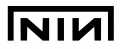
Nine Inch Nails has had many logos throughout its history, and while the original logo is still considered the band's "main" logo, this is a list of all logos that have been used over the years.
On the visual strength of the standard logo, an article from The Fader magazine[1] stated:
"The NIN logomark, which was created by Reznor and graphic designer Gary Talpas, first appeared in the "Down In It" video and has been used, largely unaltered, since 1989. It is practically flawless. It utilizes uniform line weights, mathematic spacing, bold letterforms. "NIN" is a true acronym, as opposed to an initialism. Its abbreviation is an alternate spelling of the first word it represents. The mark is symmetrical. It is graphic. It is containerized. It is legible. It is easily recreated from memory. It reproduces well at all sizes. And the list goes on."
In response to a question posted in the Access section of nin.com, Reznor stated that during creation of the logo, he was inspired by the type on the Talking Heads album Remain In Light.
Contents
Original

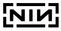
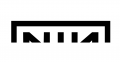
Original logo
Designed by Gary Talpas, based on Trent Reznor's concept.
On Tour
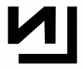
On Tour logo

A stencil variant used to mark touring cabinets and equipment.
Pretty Hate Machine
Fractured Pretty Hate Machine era logo
Fractured Pretty Hate Machine era logo


There were a couple of variants of the original, sometimes used on promotional materials during this time, where the logo has a fractured look.
Sin
Sin logo

Designed by The Designers Republic, used on the Sin single.
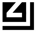
Broken

Broken logo

Designed by Talpas, used on both Broken and Fixed.
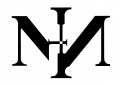
The Downward Spiral


Unused NIN logo art created by Russell Mills for The Downward Spiral, 1994.
Dissonance Tour

Pinwheel logo from the Dissonance Tour.
The Fragile
The Fragile logo

Original logo partly hidden on The Fragile cover art.
With Teeth

With Teeth logo

Designed by Rob Sheridan, based on the Talpas original.
Live: With Teeth
Many tour posters had variations on the Sheridan theme, glitch manipulation of the Talpas logo. A full gallery is accessible at Category:Tour Lithos.
Year Zero

Art Is Resistance logo

Notable logo from the Year Zero ARG.
The Slip
The Slip logo

Designed by Sheridan, used only on the album booklet.
Wave Goodbye Tour

Designed by Sheridan, used on a tour poster.
Hesitation Marks
Hesitation Marks logo

NIN 2014 Japan Tour

Used on a tour poster.
The Trilogy
Add Violence logo

Bad Witch logo


NIN 2017-2018
Europe 2018 logo